Dollar General

In 2021, I began working with Dollar General, one of North America’s largest discount retail chains, to improve its digital customer experience. My role as a UX researcher has allowed me to deeply engage with the company’s digital properties, including the website and mobile app, to ensure they meet customers' evolving needs. As Dollar General grows, the company has relied on my team and me to deliver quick, data-driven insights that help guide design decisions while keeping the customer front and center.


Dollar General Digital Products
For four years, I had the pleasure of helping Dollar General optimize and enhance its digital platforms. Dollar General tasked my team with UX research, delivering actionable insights quickly to keep pace with the competition. Our goal was always to ensure that the company's digital products remain intuitive, functional, and aligned with customer needs and expectations.

Serving as the lead UX researcher at Dollar General was a rewarding experience. I led user interviews, usability testing, and data analysis to understand customer needs, and behaviors to improve digital experiences. One key project was creating a centralized customer insights database, now used across departments to guide strategy.
I also supported UX design, creating user flows, building and testing prototypes in Figma and Proto.io for web, mobile, and app. Collaborating with cross-functional teams helped break silos and deliver seamless, user-friendly solutions. I’m proud to contribute to work that improves everyday shopping for millions of users and helps Dollar General grow through customer-centered innovation.
Context & Problem

The Challenge
Dollar General has a diverse customer base with varying levels of digital familiarity. The mobile app, website, and in-store UX needed to better support quick deal finding, coupon application, and shopping efficiency—especially for value-driven shoppers.

Goal
Understand customer behaviors at scale and redesign experiences to reduce friction, increase confidence, and improve success across all digital touchpoints.

Impact Focus
- Reduce friction in deal discovery and coupon application
- Increase user confidence across multi-channel experiences
- Improve checkout success rates and shopping efficiency
Design Decisions
We introduced story-style content on the home page, similar to Instagram Stories, to surface promotions, seasonal items, and featured deals in a familiar and engaging format. Testing showed strong desirability and usability, indicating users easily understood and interacted with this content format.
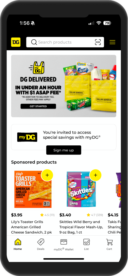
Research also showed users relied heavily on search rather than category browsing. We prioritized a prominent search bar at the top of the home page to support this behavior. In collaboration with the Product Content team, we also integrated promotional and category carousels to balance discovery with direct product search.
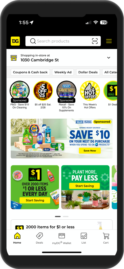
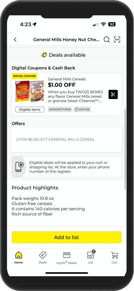
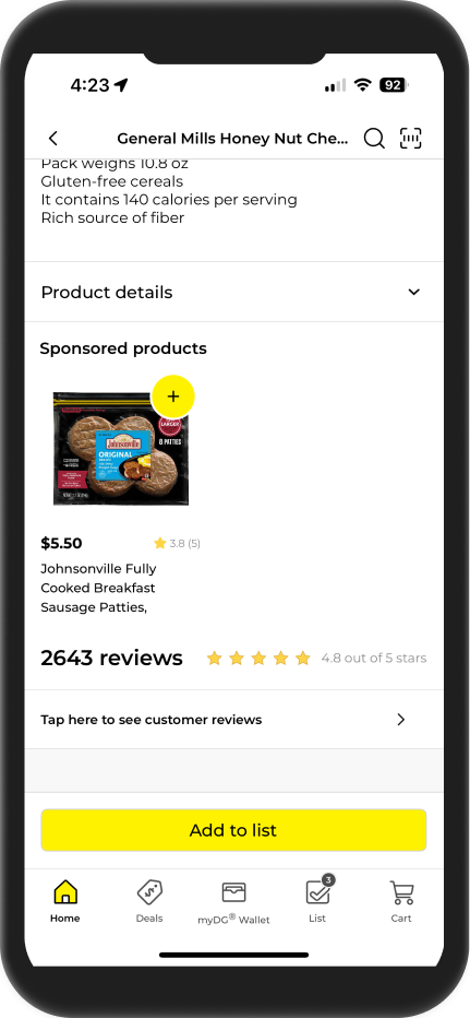
Our research indicated users needed quick access to key product details including imagery, ratings, deal opportunities, availability, and procurement options. Because availability varied by store and shopping method, we introduced disabled states within purchasing tiles to clearly communicate inventory constraints while maintaining transparency and preventing user frustration.
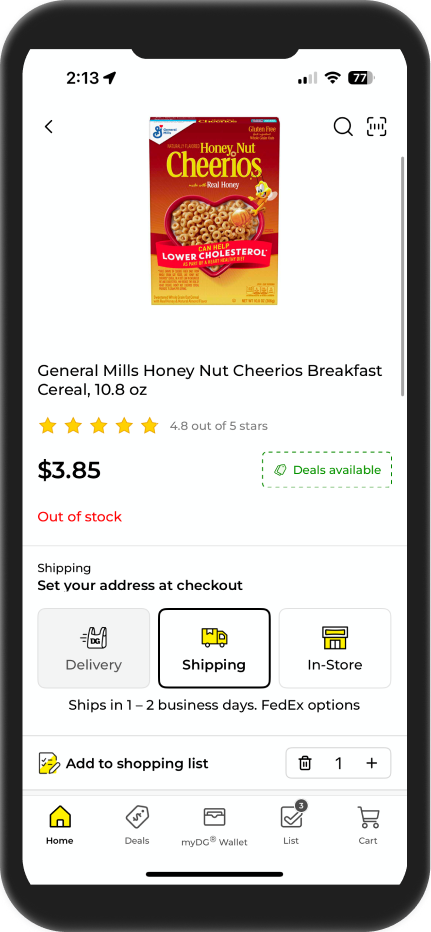
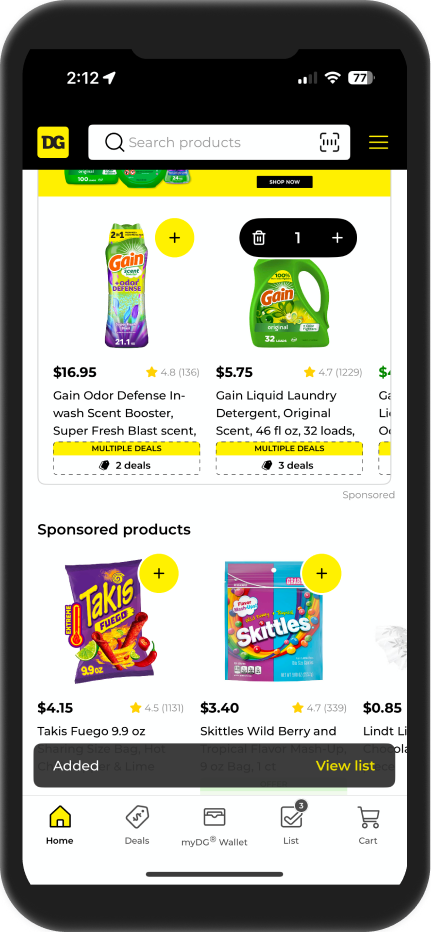
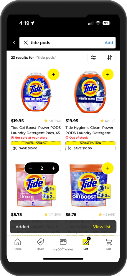
We implemented multiple micro-interactions to reinforce user confidence and system feedback during shopping actions. When an item is added, the system displays a toast confirmation, updates the quantity counter on the product tile, and reflects the change in the cart icon, providing clear visual confirmation across the interface.
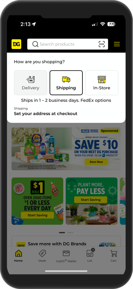
We intentionally placed the shopping method picker high in the information hierarchy on the home page. Because fulfillment options such as pickup, delivery, or shipping affect item availability and inventory, early selection ensures the entire browsing experience reflects accurate product availability and prevents confusion later in the purchase flow.
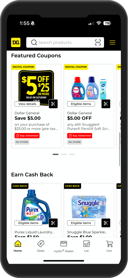
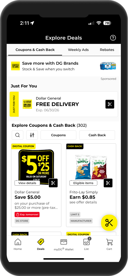
The Deals section features a horizontally scrolling navigation for different deal types, providing a clean and efficient browsing experience. Usability testing revealed navigation friction when locating saved deals, so we introduced a floating action button (FAB) for quick access without leaving the Deals section.
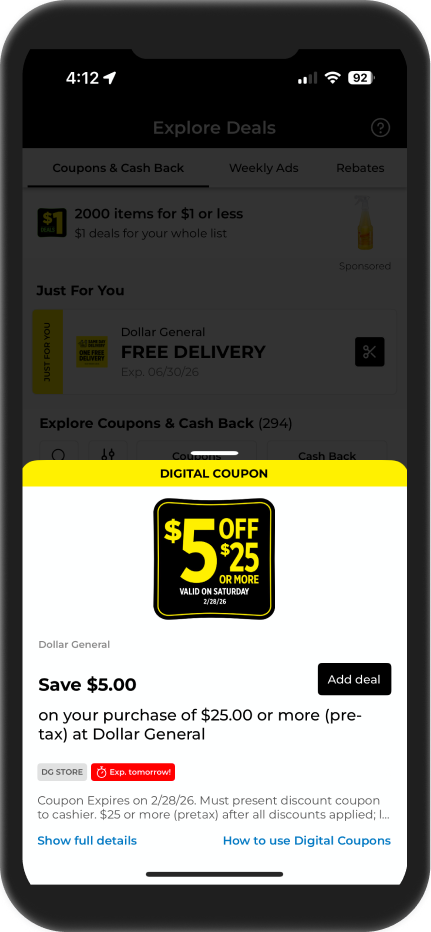
To address confusion where users believed adding a deal also added the product to their cart, we replaced the plus icon with a scissors icon. This visual distinction clarified the action and reduced misunderstanding between saving a deal and purchasing an item.
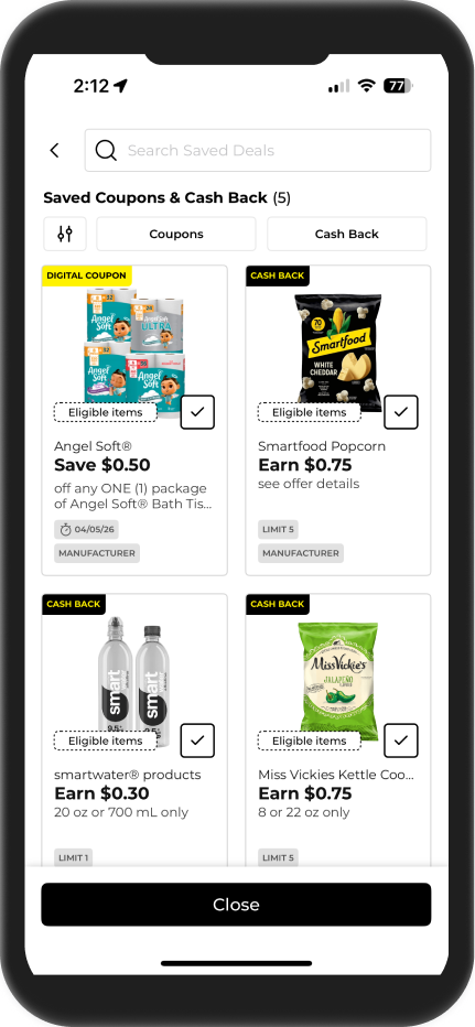
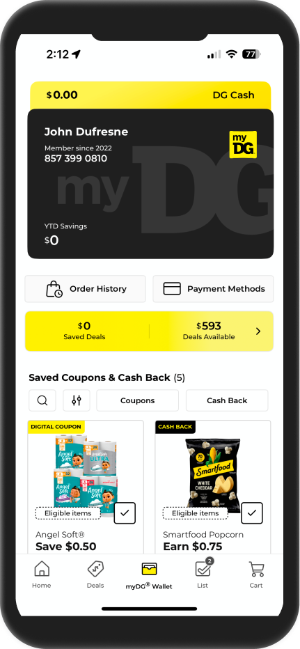
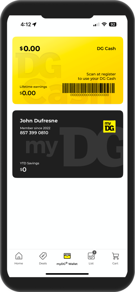
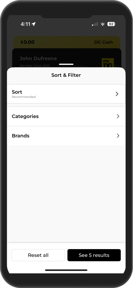
User testing validated our stacked card design for the Wallet, where users store and manage their savings. We designed a lightweight dashboard highlighting total savings to reinforce value. Filters and search support users managing multiple deals, while deal detail pages provide clear pathways to purchase associated products.
Research at Scale
I led a four-year, multi-method research program to deeply understand customer needs, behaivors, and consistently validate design decisions across digital products.


Scores
Tests
Tests
Centralized Research System


Influence on Product Development


Impact and Results